Tesla vs. Saas
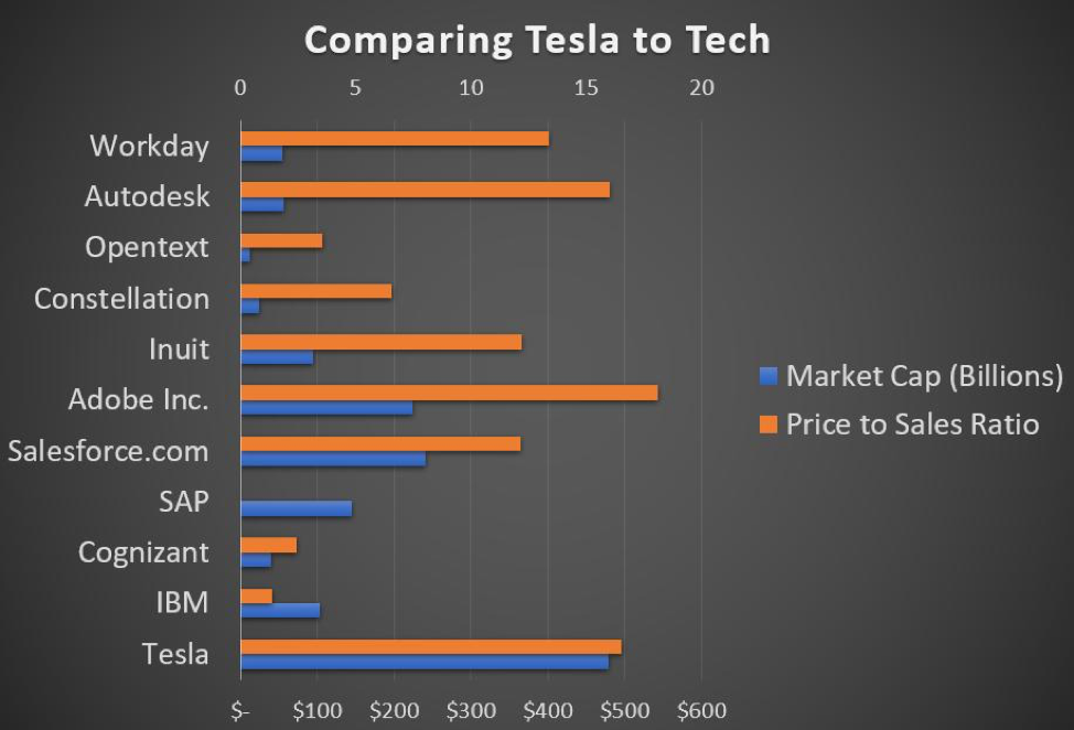
Following up on last week’s post, some investors feel like Tesla should be viewed as a software company, arguing it isn’t a pure play in the Auto sector.
Fair enough, but how much recurring revenue does Tesla have? Recurring Revenues are the Holy Grail of the software space. In 2019, 75% of Adobe’s top line revenue was recurring, proving why they are rightfully valued so high.
All the companies listed in this graph have recurring revenue, except for Tesla. Not to mention, no software company has their top line revenue propped up quite like Tesla through government https://buff.ly/3991nYt, with zero recurring revenue, is Tesla’s place as a pseudo-Automobile-Software company worth nearly half a trillion dollars?
This bubble makes us wonder if Elon Musk is selling Teslas or Tulips…
The December Bump in the Stock Market
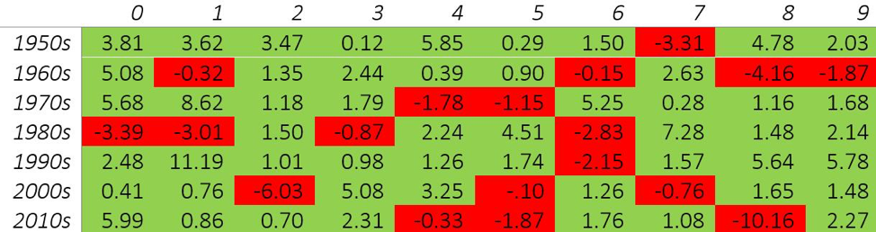
Do you believe in Santa?
If you are a stock investor, he does exist! We looked at the past 70 years of market data on the S&P 500 only to find that December usually has nice returns for investors. Almost 75% of the time, returns are green for the month of December, dispelling the old adage that the broader market seems to slump as the calendar year comes to an end.
The perceived market price drop is often due to the thought process of offsetting capital gains with tax-loss harvesting. If an investor really likes a stock, why would they sell in December vs. any other month? The December selloff is a perceived narrative, perpetrated by talking heads on business news channels.
This table shows the historical December returns dating back every year to 1950. The average return for the month of December is 1.4%, far from the inferred December slump. Short term narratives and fads are a dime a dozen, the one strategy that seems to win out is to avoid chasing them.
Sector Analysis and Trends
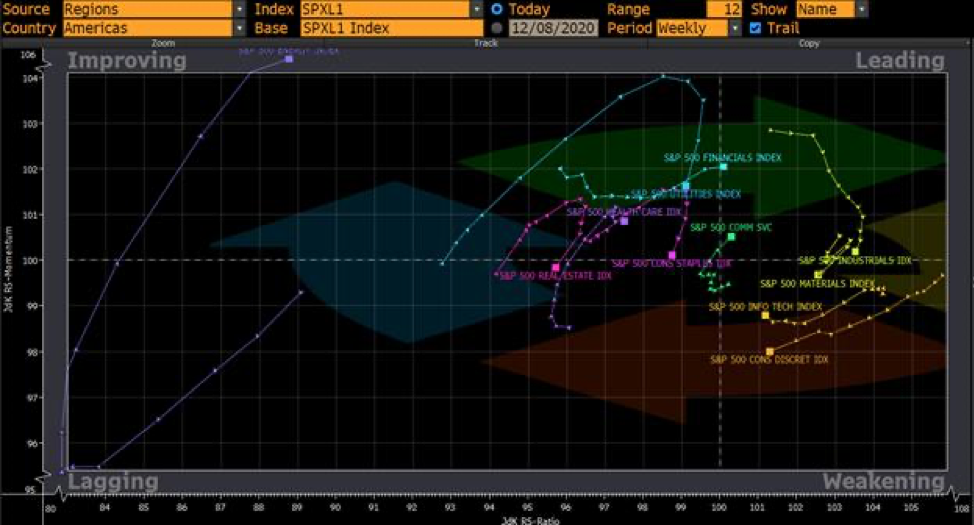
Ever wonder why diversification actually benefits most investors? Some sectors will “zig” while other will ‘zag.
Here is an interesting tool we use at Exponent Investment Management: Below is the Bloomberg Relative Rotation Graph (RRG), showing all 10 sectors included in the S&P 500 and respective shifts over the past three months.
Sector rotation and leadership changes are both fundamental to strong markets. Categorized by Improving, Leading, Weakening and Lagging, each sector is always constantly moving based on what investors are buying and selling. From a bird’s eye view, we can see trends as they happen and how this further impacts equity markets.
You will notice the energy component of the S&P 500 has been on a wild ride lately, consistent with WTI’s volatility since September. Some would watch the Financials closely with momentum beginning to build and sustain. How might this same graph look another month from now and how should you be positioned?
Which index ETFs are driving the S&P 500?
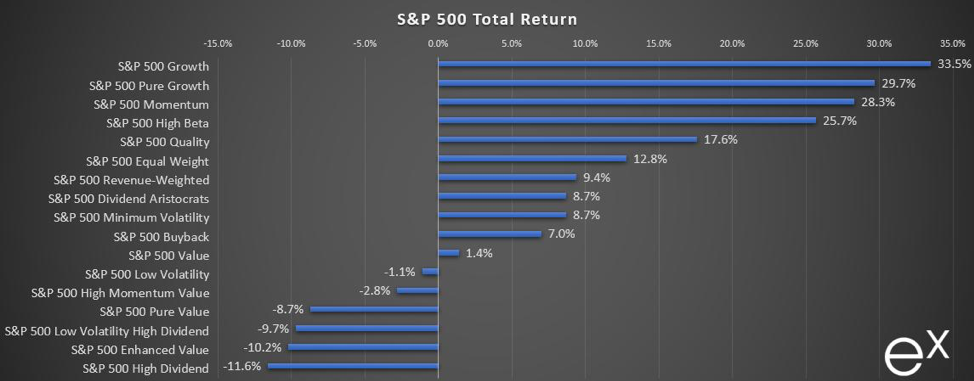
Happy 2021 LinkedIn Connections, fellow stock nerds and investors! 2020 was a wild ride that saw Bull and Bear markets in the same calendar year.
Some investors killed it while others were disappointed…assuming you did not panic back in March/April and sell everything!
Depending on which specific companies you own, your portfolio returns could be significantly different. Here we look at different areas of the S&P 500, represented by their respective ETFs.
S&P 500 Growth leads the way, with holdings like Apple, Microsoft, Amazon, Facebook, and the most recent addition – Tesla.
The laggards at the bottom of the chart are bookended by the S&P 500 High Dividend ETF, which counts companies like Invesco, NetApp, Comerica, and ViacomCBS as its largest holdings.
The most revealing takeaway? Diversification did not work for investors in 2020.
All the leaders in this chart have the lion’s share of their funds in information technology companies, sometimes as high as 40%. On the other hand, the High Dividend space is dominated by sectors such as Financials, Real Estate and Energy.
Where do we go from here? Some investors are running for the exit. This week, Billionaire Carl Icahn told CNBC that “wild rallies” are bound to end in a major painful correction.
S&P 500 Attribution: Big Tech responsible for gains
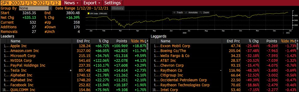
Investors and financial news observers often see the daily gains and losses for a given index, only to never think about where that number comes from. “The S&P 500 is up 15% this year” but what goes into that one single figure that represents so much? In other words, which stocks as part of an index are responsible for said gains or losses?
Enter attribution analysis, showing market movers and their respective impact on an index. The S&P 500s gains can be largely attributed to 5 stocks, to the tune of nearly 50% of the overall index’s gains. Although this may seem abnormal from a historical perspective, how will investors react to this in 2021?
TSX Attribution: Shopify soars to new heights
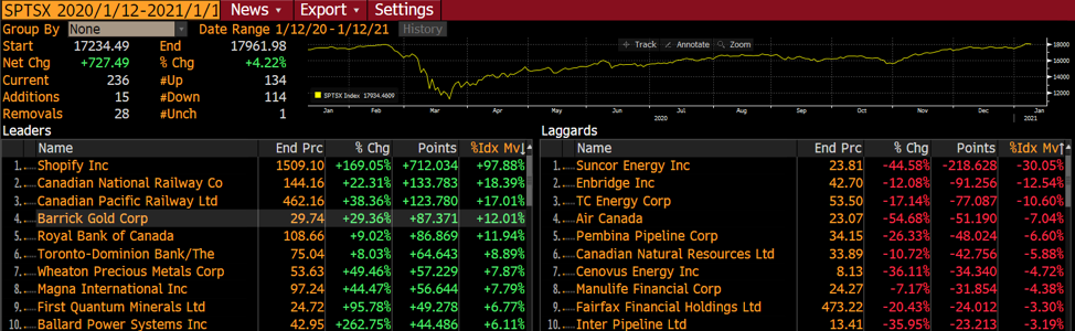
As a follow up on Wednesday’s post, where we demonstrated that diversification did not work in 2020 for the U.S. markets, let’s look at TSX Composite Index to see if things are different up here.
In an underwhelming performing market, Shopify was the lone rocket ship on the TSX. Since their IPO in 2015, Shopify has performed unfathomably well compared to any stock since…well I can’t think of another Canadian name that even comes close!
In this Bloomberg Attribution screenshot, Shopify is the root of 97% of the gains in the TSX in the past year. Although the stock has shown to be pandemic proof, can Shopify to carry the TSX performance? Feel free to weigh in in the comment section.
Commodities and their relation to the Money Supply
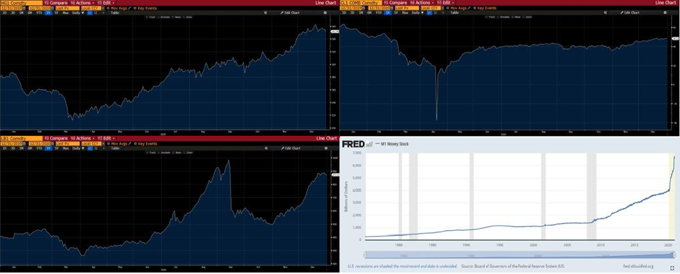
Most of us on LinkedIn have never lived through a period of inflation. Many of us have benefited from asset price inflation, but the rapid acceleration of the cost of daily life is foreign to most of us.
One of the unintended consequences of the upcoming reopening of the economy is pent-up demand. In addition to this demand, we have global central banks pumping more funds in the economy as illustrated by the M1 chart. All this capital will be chasing a finite number of goods and services.
What is being missed by many at the helm is that commodities are also zipping higher; we have included 1-year charts of CL1 (WTI), HG1 (Copper) and LB1 (Lumber). these commodities form the backbone of most of the hard goods we enjoy.
It is important to remember that the market will often ZIG when most are positioned for a ZAG.
GameStop Short Squeeze
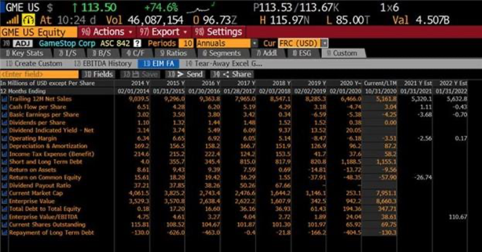
Boomers Vs. Millennials. Or should I say Don Vs. Hunter/Ashley? I am talking about GameStop (GME)… up 9x since January! A company who’s raison d’être is to rent space in a mall and sell video games to teens.
This is 2021, no one is going to the mall, and we are all downloading our games. Pon the replay for Blockbuster.
Attached is the financial snapshot. It is the epitome of ugly. GME has seen their sales cut in half over a 6-year period, with a negative operating margin had has been the playground of short sellers for years where 80% of the share float was short.
But then something happened. Not sure what it is…perhaps it is a Chewy founder buying a significant stake…or perhaps it is Robinhood DIY investors buying into names based on message boards.
We have never seen a confluence of events like this: Short sellers are forced to cover their shorts by buying the stock back… and spiking call option open interest forcing market makers to hedge by…buying more shares. But there are very little shares available…so the price goes up HARD!
The only advice is to remember that excess in one direction will lead to an opposite excess in the other direction (as per Bob Farrell’s 10 Rules for Investing).
What drives an index?
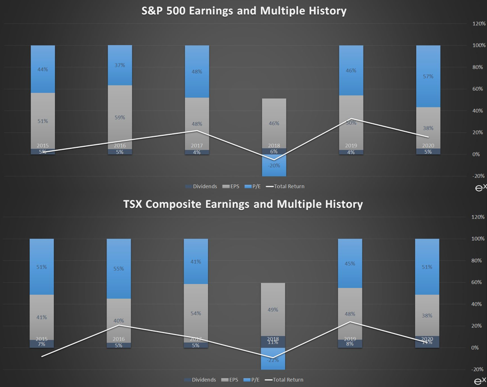
Did you know that there are only two levers that are the source of your return on investment in stocks?
The source of returns are dividend income (if any), and price appreciation. Price appreciation when you focus on profitable companies is comprised of the value of the earnings X the earnings multiple (and what investors are willing to pay for those earnings).
We’ve highlighted both the S&P 500 and S&P TSX Composite Indexes below: the blue boxes (earnings multiple) have added and taken away the positive contributions made by earnings growth and dividend income. It is a visual illustration of what investors fret about on a daily basis: what will other investors pay for each dollar of earnings?