
Another Good Quarter
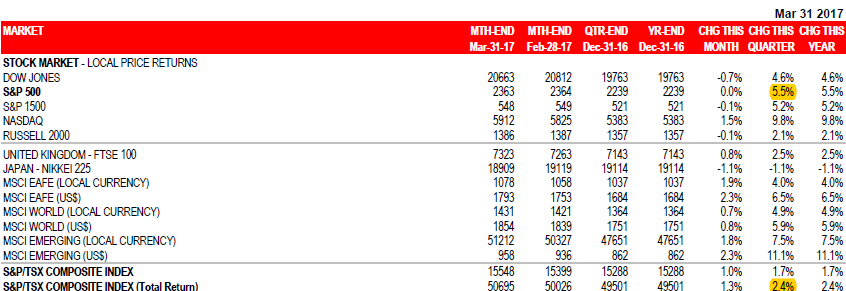
- The equity markets had another good quarter overall. Most developed and emerging markets opened 2017 with positive results, showing a broad-based performance that was good to strong. Close to home, in the United States, the S&P 500 generated 5.5% (in USD) for the quarter, while our TSX turned in a 2.4% total return (in CAD). Exhibit 1, below, shows these and other market indices.
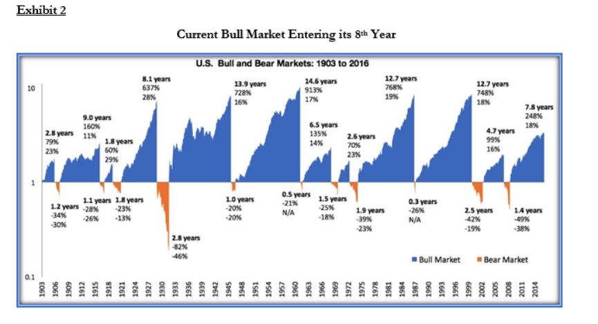
- One has to wonder when this positive performance will end. After all, everything that goes up must come down at some point. And this bull market has been going on for 8 years. Exhibit 2, below, illustrates over a century of alternating bull and bear markets. Historically, bear markets start on average after—you guessed it—an 8thyear of positive returns… It is no wonder that we are worried, and that many pundits are now ready to call a market top.
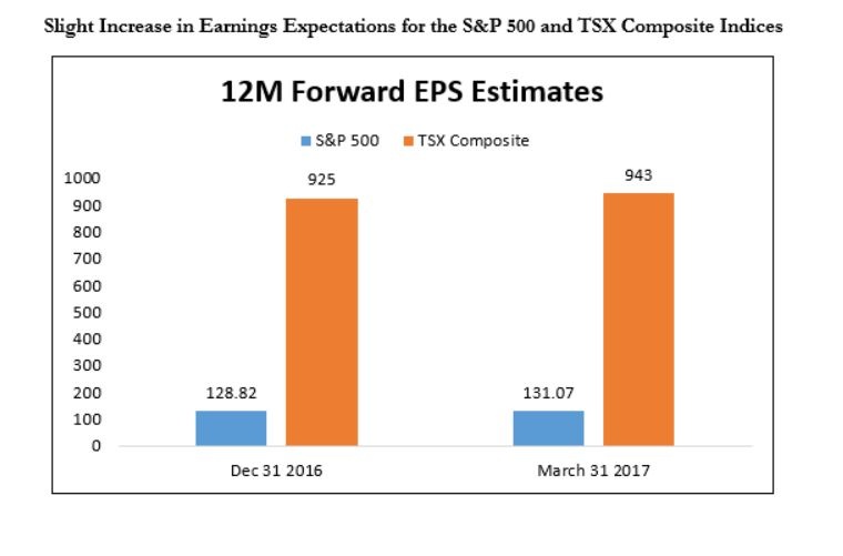
- An argument can be made that this “bull” still has room to run. While stocks are generally expensive, earnings continue to grow with the general economy. Granted, the pace of this growth is not earth-shattering, but it is nonetheless evident. Exhibit 3, below, is a summary of the earnings expectations for each North American market. We can see that they have increased slightly over the last quarter.
- While we are far from sanguine about the current market levels and their potential for further increases, we do not see any data that would cause us to join the bear camp. We are mindful of prices, and have been following a strict regimen: when valuations of individual stocks are high, we are sellers. We continue to search and sometimes find good values. However, we lately find ourselves more as sellers than buyers. The net result for our clients is that we have higher-than-usual cash positions.
- Our conclusion is that unless we see a significant increase in long-term interest rates or an unforeseen geopolitical or economic shock, this bull market will continue on its path. We nonetheless continue to exercise caution.
1st Quarter 2017 Market Drivers
1. U.S. Markets
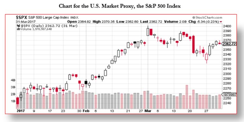
The U.S. market’s path for the quarter shows no real volatility and produced a decent 5.5% return (in USD). What is maybe telling is that this market is now led by the technology sector, which is no stranger to exuberance.
Case in point, Tesla Motors is currently more valuable than GM, at over US$50 billion. The following figures help put things in perspective:
- Last year, Tesla sold 76,230 cars and produced 83,922;
- Expectations for 2017 are sales of 114,000 units of its existing models and another 100,000 to 200,000 (yes, that is a HUGE spread) in sales for the Model 3.
- As for GM, it sold 683,698 cars in 2016 and is expected to sell about 690,000 in 2017.
- However, when looking only at the U.S., relative sales are different. There, GM sold 24,739 Chevy Volt last year, while Tesla sold 28,896 Model S and another 18,223 units of its Model X.
All this to say that the Tesla craze reflects a certain irrationality.
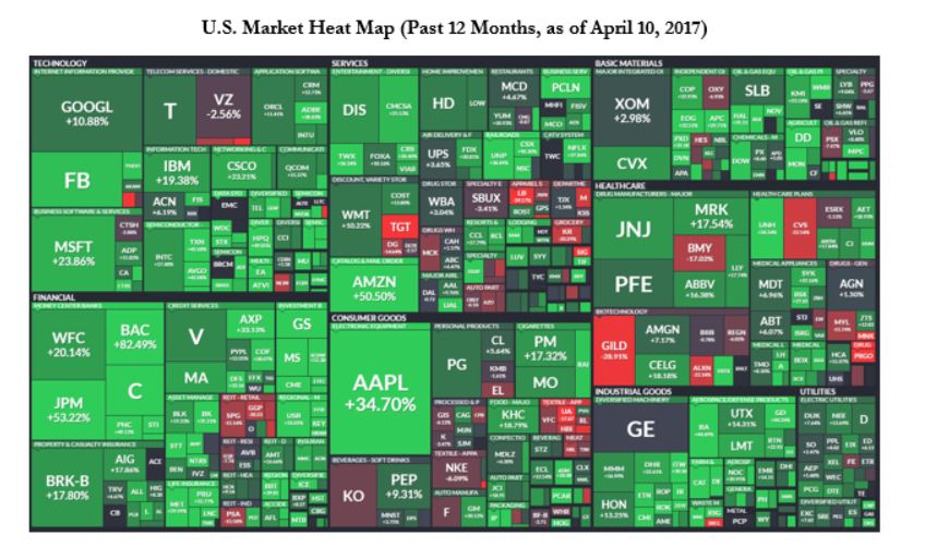
This map makes it plain that the non-performers are occurring for the most part in the healthcare and retail sectors. In green, the strongest performers continue to be the technology and financial sectors. Unfortunately, these companies’ valuations and prices reflect an investors’ optimism that, in most cases, we do not share.
In short, we are seeing in this market many great companies that seem to represent poor investments. We’ll pass, thank you very much.
About this map: Heat maps such as this one are an interactive tool we use to visually identify trends within a given market. The S&P 500 index, the proxy for the entire U.S. market, is divided into Technology, Financials, Services, Consumer Goods, Basic Materials, Healthcare, Industrial Goods, and Utilities. Companies’ capitalization and weighting within the index are represented through area size. Finally, colours indicate performance: green means positive, red negative. The brighter the colour, the more pronounced the movement up or down.
1.1 Valuations
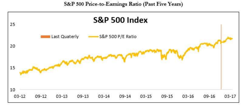
The price-to-earnings (P/E) ratio is a measure of how expensive stocks are, relative to corporate earnings. In this chart, the upward trend is unmistakable, which is normal during a bull market. However, an unavoidable fact of investing is that bear markets do not begin with a cheap market, but with an expensive one, such as this one. As valuations are getting more expensive, an outside, unforeseen shock could more easily knock this bull down its hill.
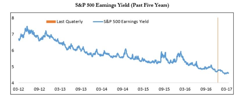
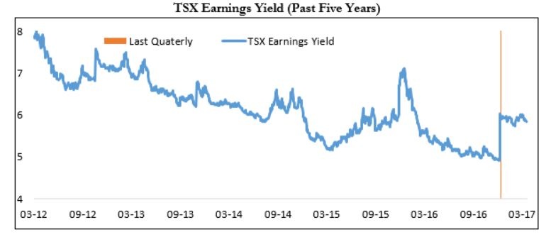
The earnings yield is simply the inverse of the P/E ratio. It lets us compare what investors can earn on their investment in stocks relative to prevailing interest rates, such as the lower risk 10-year U.S. Treasury bond. Currently, the yield on the 10-year U.S. Treasury bond is 2.42%, and the earnings yield is 4.6%. To place things in perspective, five years ago the earnings yield was in the mid-7%.
What this means is that, should interest rates rise, investors would most likely demand a higher earnings yield. In such a situation, unless companies’ earnings were to rise quickly, this would translate into lower equity prices.
1.2 Earnings
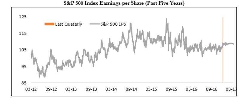
The graph illustrates the fact that earnings have gone down a little, yet remain near their peak. As long as earnings, which act as the stock market’s engine, are holding up, the market remains strong. The reason why they are not above their peak is that the energy sector is not generating as much earnings as it did when oil sold for $100 a barrel.
1.3 Risk Appetite
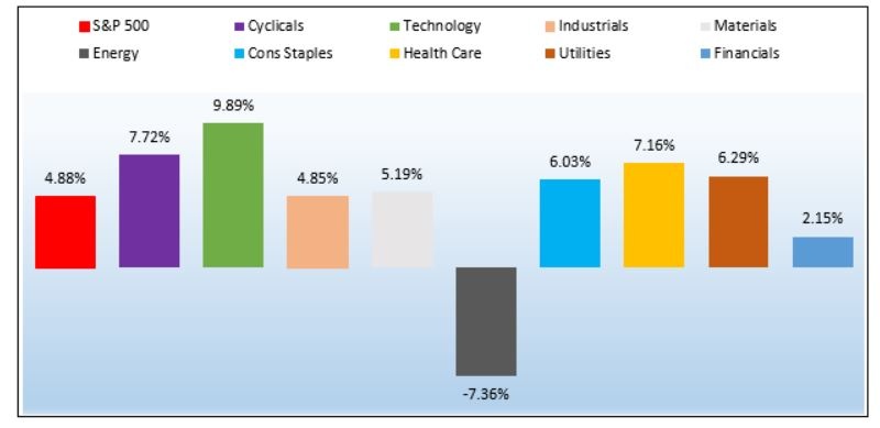
I like to refer to the chart above, as it shows the winning and lagging sectors. Except for energy, all sectors generated positive performance in the U.S., with technology being the leader.
1 Canadian Markets
The Canadian market provided yet again a surprising performance. In particular, Energy, Materials and Financials continued to exceed our expectations.
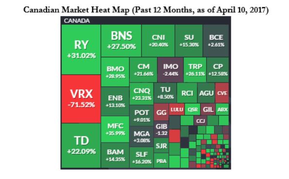
Like the U.S. heat map shown above, this heat map of the Canadian market helps to visually identify market trends by summarizing relative performance within a given market. Not surprisingly, we can see that the financial sector pulled most of the weight during the past 12 months on the Canadian market.
2.1 Valuations
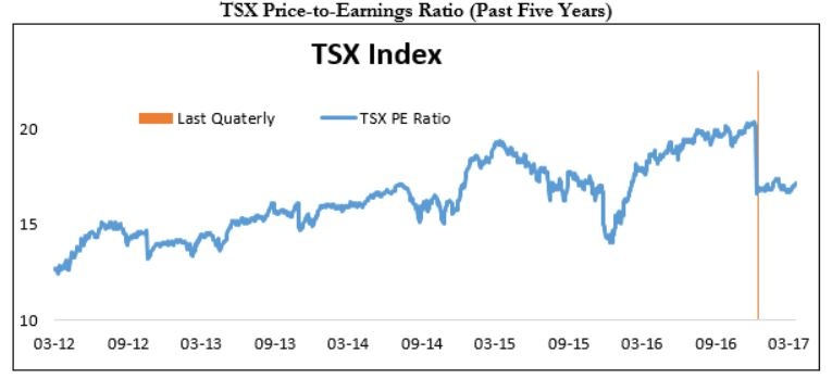
Based on its price-to-earnings ratio, the TSX actually became a better deal this quarter. And not because of any sell-off in the index, but rather because earnings were much higher than expected, as shown below.
In particular, earnings from the financial sector came in higher than expected. The banks’ actual loan loss provisions were lower than forecasted, which helps to explain some of those good results. Also, the energy and mining sectors beat expectations.
In short, the market is now a better value than last quarter, which is a surprise. We do not know if this is the start of a trend, or a simple blip.
2.2 Earnings

The earnings per share of the TSX reflect the surprise increase mentioned above.
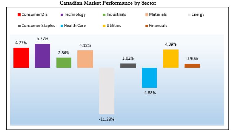
All sectors, except for energy and healthcare, generated a positive stock performance. Good earnings combined with a negative short-term performance make energy an intriguing buy candidate. We have just purchased one name, and may buy more.
3 Foreign Markets
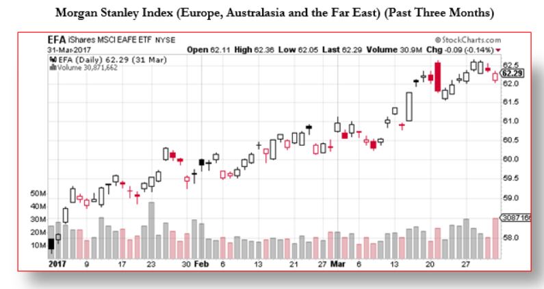
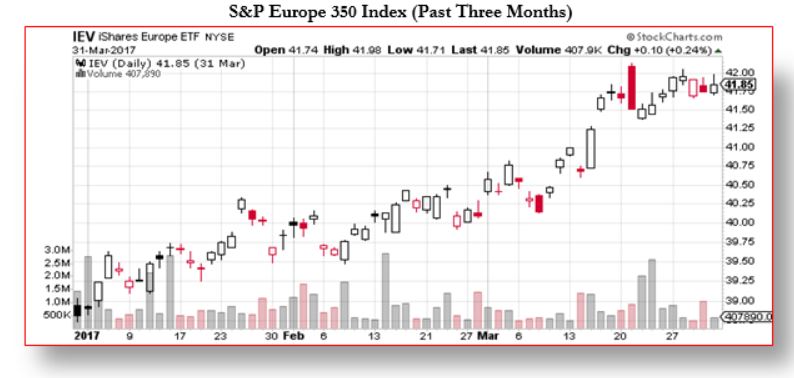
In USD, the quarterly performance for developed markets, excluding the U.S. and Canada, was a strong positive 6.5% return. We continue to have concerns around USD-denominated debt. With a stronger USD it becomes more difficult for foreign countries to make interest payments from their domestic currency. We expressed this concern throughout last year in this report, however this does not seem to weigh in on investors. We are comfortable being looked at as contrarians when our fundamental analysis is clear.
4 Bonds and Interest Rates
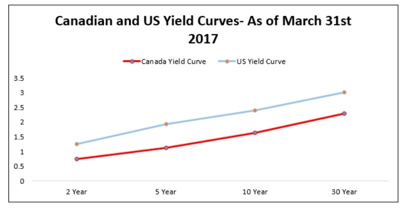
The yield curve is the plot of the yield (Y axis) of maturing government bonds over their maturity (X axis). The shape of the curve is important. Right now, it is ascending, as it should be. This means that rates for short-term bonds are lower than for longer-term bonds. This is perfectly normal.
However, as this graph illustrates, rates are lower in Canada than in the U.S. This is bearish for our loonie.
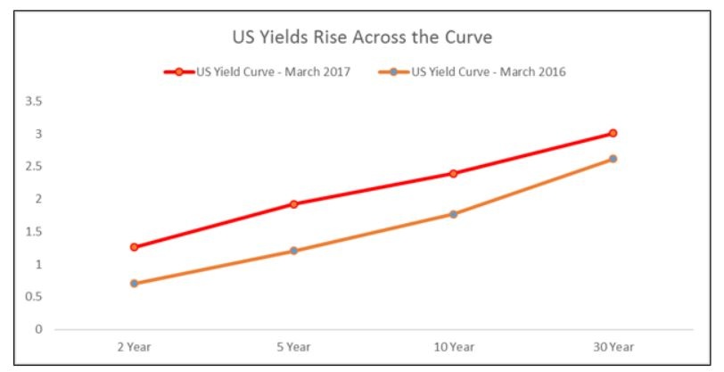
This chart shows the yield curve for the U.S. bond market as of now and as of the same time, last year. We monitor these graphs for any changes in the yield curve and as to whether rates are higher or lower than 12 months ago. As it turns out, the shape has not changed, but rates are significantly higher than at the same time last year. Neither the shape nor the level cause us to have any concerns.
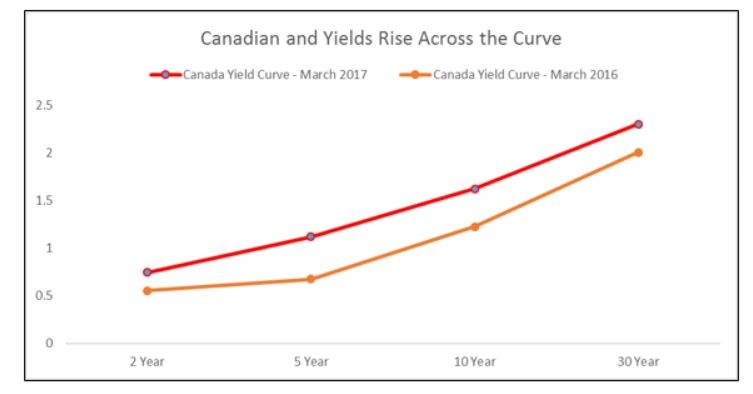
This is the equivalent chart for Canada. In our country, we see that the curve’s shape did change, reflecting the fact that rates are higher than last year, particularly in the 5 year sector. However, the shape and the level are not problematic.
5 Options
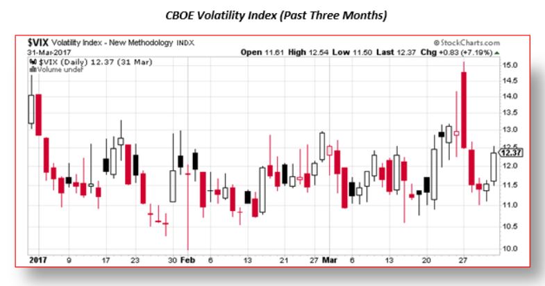
The CBOE Volatility Index (VIX) chart measures the volatility of the S&P 500 index on 30-day rolling periods. This chart shows that volatility levels continue to be lower than usual. This means that investors remain complacent. In fact, we are officially in a “volatility bear market”. Late last March, volatility spiked and subsequently melted down to below 12. (A VIX of 15 or less indicates a lack of fear on the part of investors.)
Our options strategy aims at converting market volatility into tax-advantageous income by selling options and collecting option premiums. The higher the volatility, the higher the option premiums we collect. Every quarter of last year represented pretty much ideal conditions for our conservative option strategies. Current market sentiment will pass, and we have no doubt that volatility will return.
6 Our Opinion
We remain cautiously optimistic. Our risk controls revolve about being cognizant of valuations. If stocks reach and surpass prices that our research demonstrates to be above their fair value, we will sell them and look for better opportunities.
We continue to monitor the headwinds and will not hesitate to raise cash as our valuation targets are met. Conversely, we will be patient with our investment to ensure that our purchases are done at attractive prices. We do expect some larger-than-usual cash balances as we move through this process.
We have noticed an interesting pattern in the past year and a half. It corresponds to the idea of a rotational bear market. Recently, retail and healthcare stocks have been the “under-owned” sectors, but they have come on strong in the past three weeks. Twelve months ago, the same could be said for Industrials, who had some of the best performers (think Caterpillar or Cummins). So while the overall market should be considered expensive, there continues to be pockets of value.
One needs to look hard enough and ignore the ominous headlines associated with the weak short-term stock performance. This is what we do, and will continue doing for you.