
U.S. and foreign markets march on
This last quarter, nature and politics have been in turmoil south of our border. To the North, risk is also on the increase—in the stock market. In fact, despite glowing index returns, results in general are down on the Canadian stock market. Find out what drives the TSX and why we see signs that markets could be nearing the end of a cycle.
Also of note this quarter, and further developed in this report:
- the U.S. market registers another strong performance;
- Europe continues to do well;
- the under reported sharp rise of the Canadian dollar is, on this rare occaision, not due to oil prices
U.S. Markets
The U.S. market is having a very good year. We remain confident about the prospects of U.S. stocks. Employment surveys and retail spending continue to paint a picture of economic health.
Earnings and price growth are expected to continue…
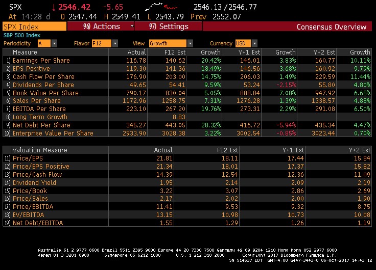
This is reflected in the analysts’ consensus for the S&P 500 Index, shown below. In particular, earnings per share (item 1) are expected to grow by an impressive 20.48% over the next 12 months, by 3.83% in 2018, and by 10.11% in 2019.
Results and Consensus Overview – U.S. Market (S&P 500 Index)
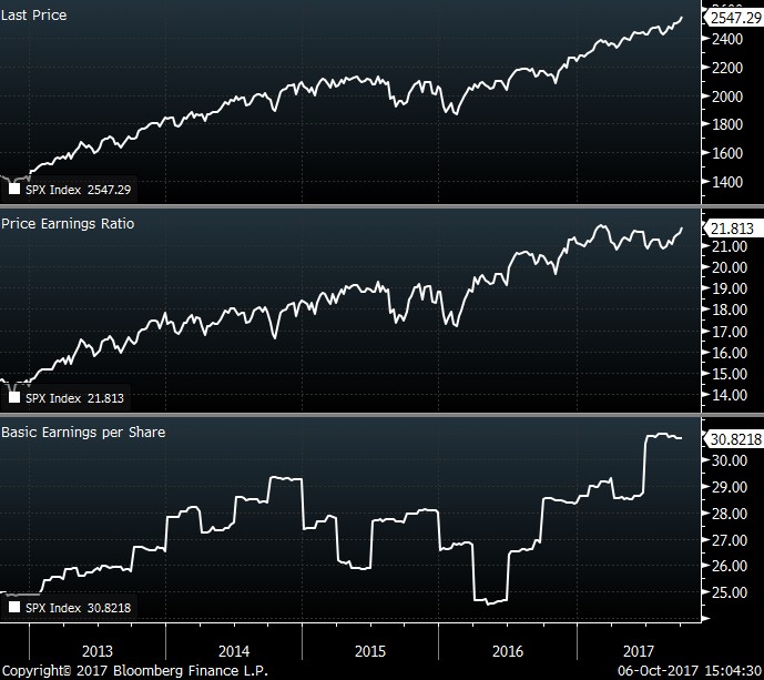
Trends in price, valuations (P/E, or price-to-earnings, ratio) and earnings of the S&P 500 Index are illustrated below. Except for the 2016 drop in basic earnings per share* (third pane), all three components have been climbing steadily in lockstep.
(* This drop was largely due to the decrease in the energy sector and the increasing strength of the greenback. Not only did exports diminish, but export revenues, for a given volume, decreased when converted to U.S. dollars. This situation has now completely reversed.)
… but stocks are becoming expensive.
Especially telling is the rise of the P/E ratio. Where investors paid about 15 times the expected earnings in 2013, they are now willing to shell out almost 22 times the expected earnings, or 50% more. During the same time period, earnings per share (bottom pane) increased by only about 20%.
Prices and Earnings – U.S. Market (S&P 500 Index)
Rather than paying the high average price of the stocks forming the U.S. index, we are focusing our attention on less expensive stocks, many of which have been unfairly maligned of late. We find good value, at good prices, in retail stocks, and in a few oil and gas operators.
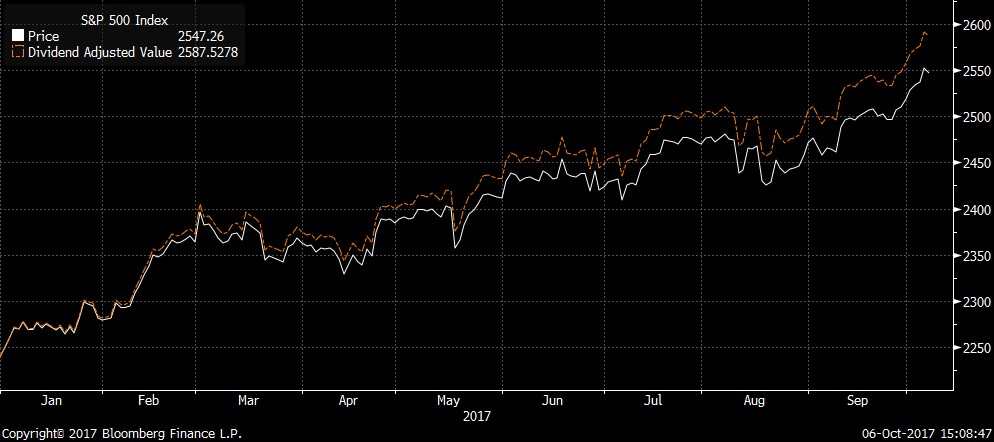
In the chart below, the white line shows the path taken by the price of the U.S. index since the beginning of the year: a narrow one, steadily going up to the top right quadrant, with very little in the way of drawdowns. The red line illustrates the impact of reinvested dividends, called total return, which is pertinent to us, here at Exponent, as we focus on dividend-paying stocks. The total return in USD was 14.24% (5.9% in CAD terms) for the year, and 4.48% (0.5% in CAD terms) for the quarter.
Price Return and Total Return – U.S. Market (S&P 500 Index)
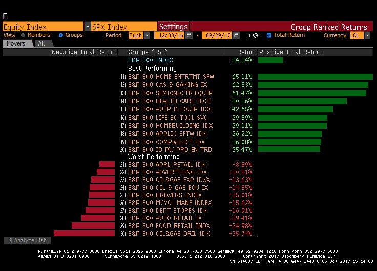
Some sectors of the S&P 500 have been very strong. In fact, anything related to technology was stellar. However, most of these flying stars involve a degree of risk which disqualifies them from our realm. For instance, the top three performing sectors are comprised of video game publishers (+65%), casino operators (+62%), and semiconductor manufacturing (+61%). Within these, only one name pays a dividend and would be considered for inclusion in our stock universe.
Best- and Worst-Performing Industrial Sectors (year-to-date) – U.S. Market (S&P 500 Index)
Best- and Worst-Performing Companies* (year-to-date) – U.S. Market (S&P 500 Index)
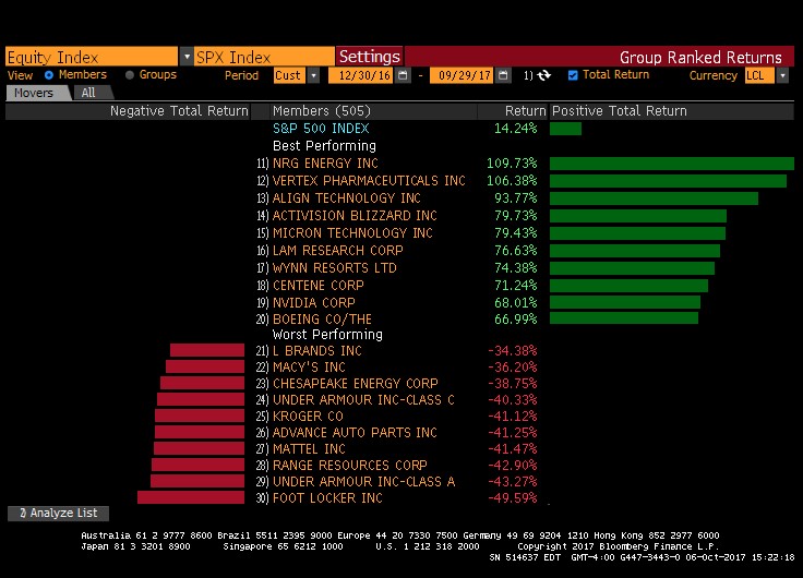
* For information purposes only, as Exponent does not own any of these individual stocks.
Canadian Market
Right now, investments on both sides of the border are flocking to more speculative sectors, as equity investors look to increase their short-term returns. However, given the small size of the Canadian stock market, this phenomenon is more extreme and results in an interesting situation: published index returns continue to increase while actual results are below average… How come? To understand this better, let’s have a look at the table below.
Results and Consensus Overview – Canadian Market (S&P/TSX Composite Index)
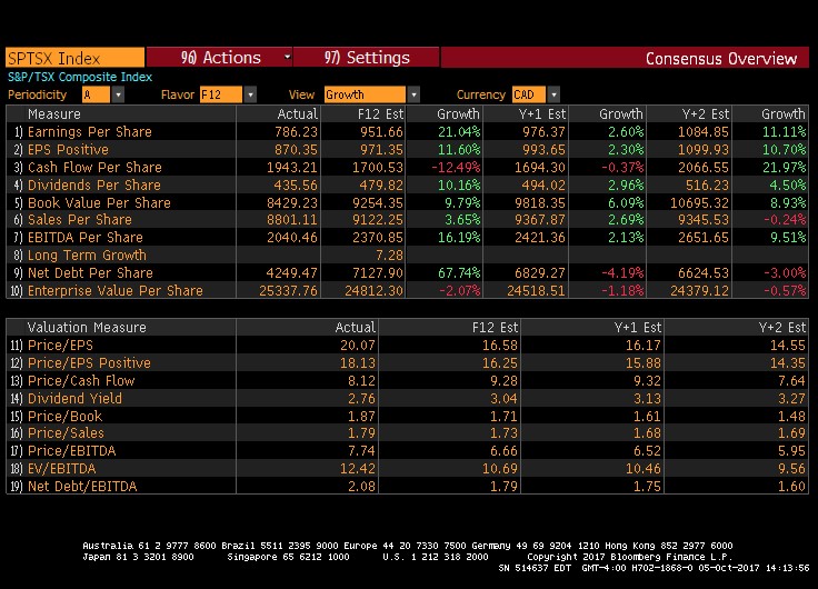
Two measures in particular are telling:
- Earnings per share (item 1) are expected to grow at a 21% rate. Before we get excited however, much of this growth is from the Energy patch, which is simply retracing its precipitous drop (caused by lower oil prices during the past two years). Also, the market expects this growth to almost completely deflate in 2018.
- Debt per share (item 9) has doubled. As a set rule, Exponent stays far away from heavily indebted companies and sectors desperately seeking growth at any price.
To get a clearer picture on whether the market is expensive or not, let us now look at prices relative to earnings.
Prices and Earnings – Canadian Market (S&P/TSX Composite Index)
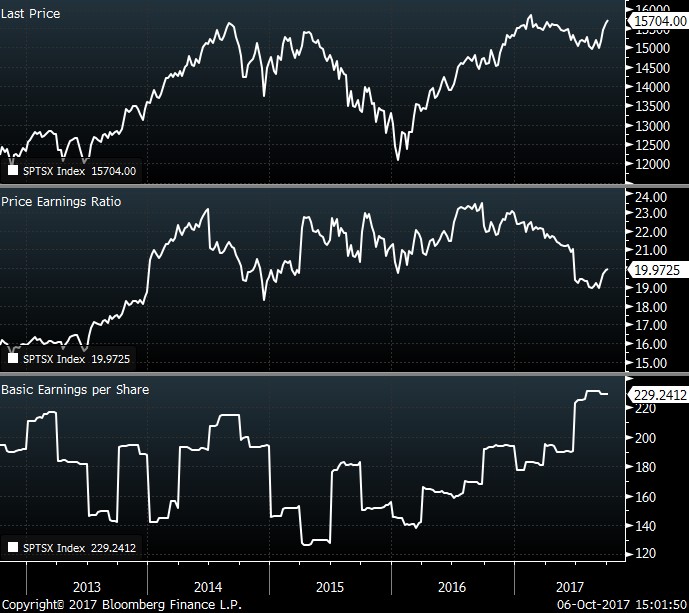
Thanks to the Energy sector’s recovery, earnings (bottom pane) have rebounded nicely, at nearly $230 for each share of the index. Prices (top pane) have been stagnating this year (right-hand section). In other words, the market, as represented by the index, is slightly less expensive than it has been in the past. However, the index is currently valued (middle pane) at 20 times the expected earnings—neither expensive nor cheap.
Clouds over the Canadian economy
The future expected growth would make this valuation more compelling if these expectations were to be realised. However, we currently do not agree with the consensus of a rosy economic performance for Canada, for the following reasons:
- While the energy patch is mending, the current backdrop is not conducive to growth, viz.,
- Canada is looking at deficit spending, much of it on rent-seeking benefits (e., these will not produce long-term impacts);
- The legislative and social context is not favourable to large projects, as seen with two recent pipeline projects (Energy East and Trans Mountain) abandoned by their promoters;
- There is uncertainty about changes in taxation for small businesses.
- Real estate continues to be a concern. High prices have led the Canadian consumer to take on unprecedented debt.
Price Return and Total Return – Canadian Market (S&P/TSX Composite Index)
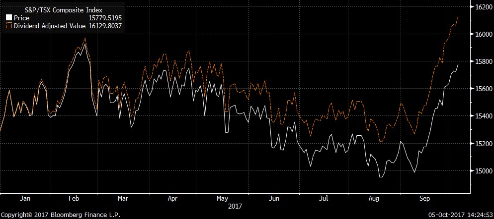
The above chart illustrates the behaviour of the S&P/TSX Composite Index since the beginning of the year. The returns were negative up until September. The bounce is attributable to the rebound in oil prices, which positively impacted the oil and gas stocks.
Best- and Worst-Performing Industrial Sectors (current quarter) – Canadian Market (S&P/TSX Composite Index)
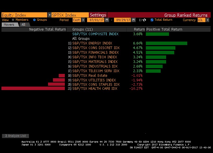
In the chart above, we have the sectors that comprise the Canadian market. While the total return for the S&P/TSX Index was 3.68% for the quarter, the two largest components (Financials and Energy) performed even better, with Financials at 4.5% and Energy at 6.6%.
However (see following table), the returns for the year for both sub-indexes are lower than expected, with Energy actually negative at -7.6%.
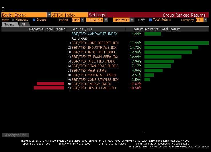
Best- and Worst-Performing Industrial Sectors (year-to-date) – Canadian Market (S&P/TSX Composite Index)
We have also highlighted (in the following table) the best and worst-performing stocks for the quarter on the Toronto Stock Market.
Best- and Worst-Performing Companies (current quarter) – Canadian Market (S&P/TSX Composite Index)
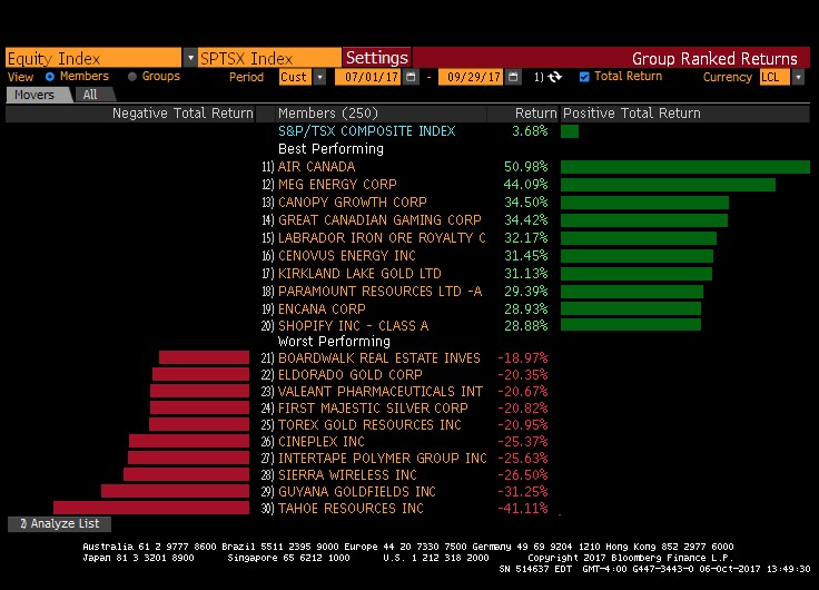
The distribution of returns is very uneven, with a wide gap between the best and the worst, and a strange concentration in a few sectors and names. What is especially striking is that the overall return (close to 3.7%) is largely due to stocks that are undeniably speculative, such as Canopy Growth Corp. (a marijuana grower), Great Canadian Gaming, and Shopify. At the same time, we see solid companies, such as Boardwalk, Cineplex, Intertape Polymer, and Sierra Wireless, producing a negative return.
When investors’ growth comes mostly from unsafe investments, we interpret this as a sign that markets could be nearing the end of a cycle.
With high consumer debt, high real estate prices combined with a complex political backdrop, and a stronger currency, we feel very fortunate to have the ability to look beyond our borders – more specifically to the U.S. and to Europe, where we can invest in some unique franchises, explaining our leeriness about the prospects for Canadian equities.
Foreign Markets
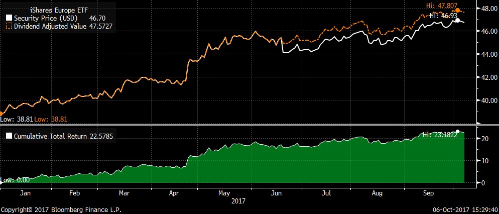
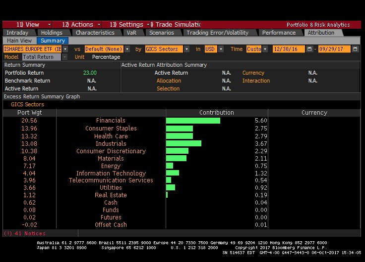
Europe continues to perform well. The IEV ETF, which represents the large-cap, dividend-paying names, has a 20% return.
Price Return and Total Return (year-to-date) – European Market (iShares Europe ETF)
In fact, when we look at the performance attribution of the European market, every single sector has a positive return so far in 2017. We have focused our attention to the Consumer Staples and Health Care names based in Europe (see table below). We are quite pleased with our decisions.
Best- and Worst-Performing Industrial Sectors (year-to-date) – European Market (iShares Europe ETF)
Bonds and Interest Rates
Though equities are always fun to chat about, bonds and interest rates are much more important to our everyday lives. In the simplest terms, interest rates are the price of money over time, as agreed upon between those who want to borrow funds and those who want to lend funds.
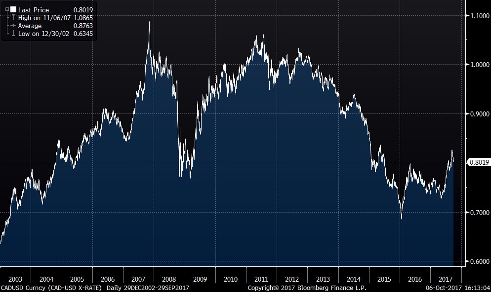
For instance, one of the most salient features of this quarter—the sudden uptick of the Canadian dollar relative to the U.S. currency—is largely explainable through this lens. The Bank of Canada, wanting to cool off the frothy Canadian real estate market (which became somewhat overheated thanks to historically low mortgage rates), recently enacted two increases in the key rate. This rate now stands at 1%: still lower than normal historical levels, but the highest in many years.
In parallel, our loonie went from a low of 0.72 USD in Mid-May, to a peak of nearly 0.83 USD this quarter. This is both abrupt and historic.
We have plotted the yield curve as of the end of Q3, and compared it to the previous quarter and the beginning of the year. Yields (Bond prices move in opposite direction to interest rates. For instance, when interest rates rise, bond prices decrease. This relationship is the yield.) are rising… and yet, no one seems to be talking about it!
Let’s look at the chart:
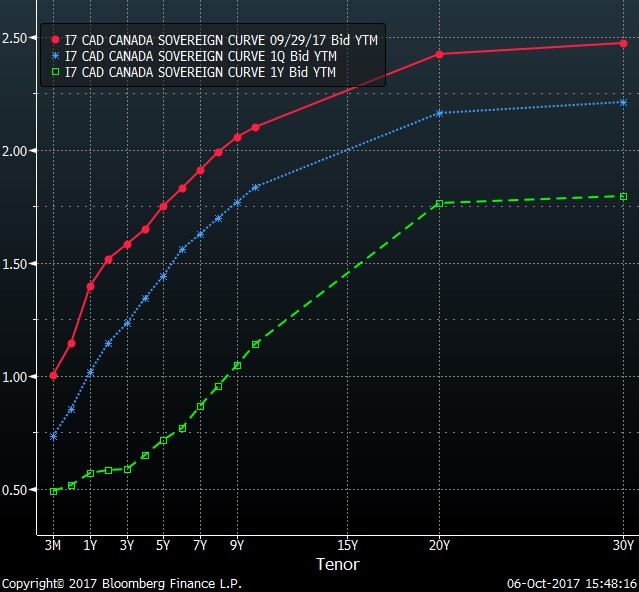
The red line is the yield curve as of the end of September, the blue is as of the end of June, and the green is as of the end of September 2016. The biggest move has been in the shorter maturities. This is logical, as the Bank of Canada raised the short-term overnight rate by 0.25% this quarter.
Below, a look at the U.S. shows clearly that there has not been as much action.
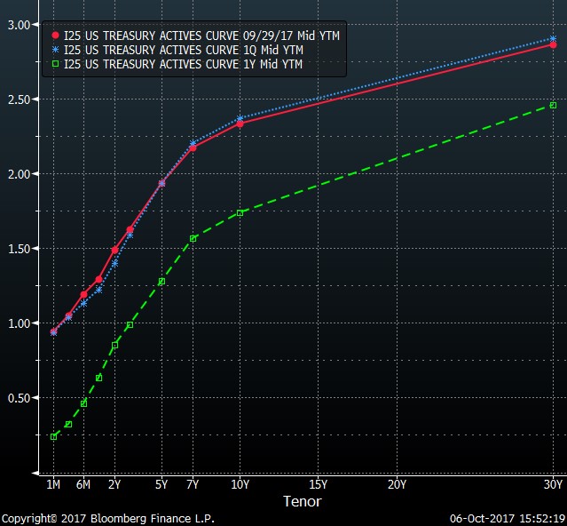
Yields have barely changed since June 30: the red and the blue lines follow almost the exact same path.
This difference between our respective gaps (red and blue line widely separate in the Canadian graph, while very close together in the U.S. graph) illustrates what happened with the currencies. The fact that interest rates in the shorter maturities rose in Canada and not the U.S. would explain the violent appreciation of the CAD versus the USD. As the gap between these yields widened, money became more valuable in Canada.
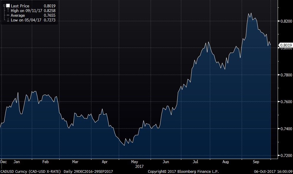
We have had to go back to 2007 and 2009 to see (in the table below) such an appreciation of the CAD versus the USD. Both of these instances were unique as they were tied to the increase (and decrease) of oil prices.
In fact, our loonie is often referred to as a petrocurrency. This reputation is well suited, as the chart below illustrates. We have plotted the price of oil and the exchange rate to the USD.
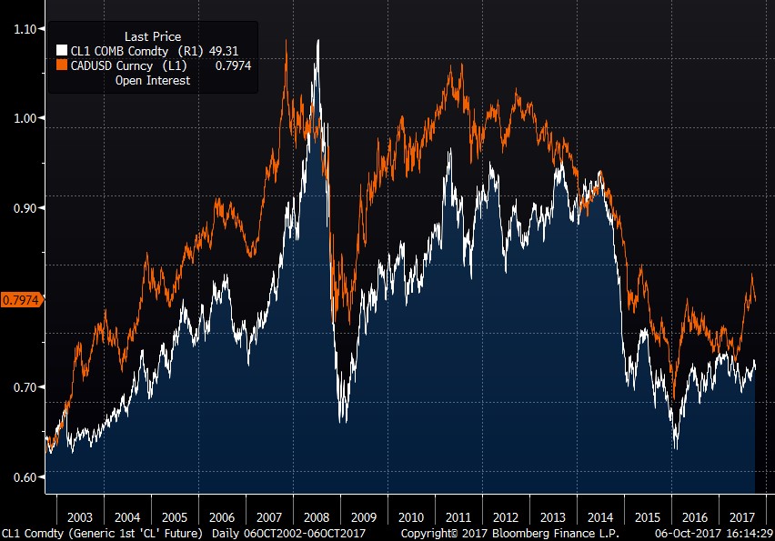
The fit between the two charts is remarkable. Furthermore, we can easily see that the most recent appreciation is NOT connected to the appreciation of the oil price.
Options
The options market remains subdued as there have not been any bouts of market gyrations.
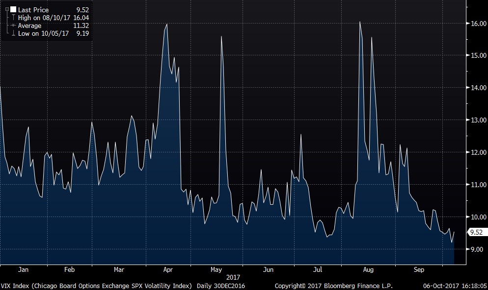
In fact, we have to go back to the period of late 2006 and early 2007 to see the VIX Index (a rolling measure of the volatility of the S&P 500 index) at such a low level.
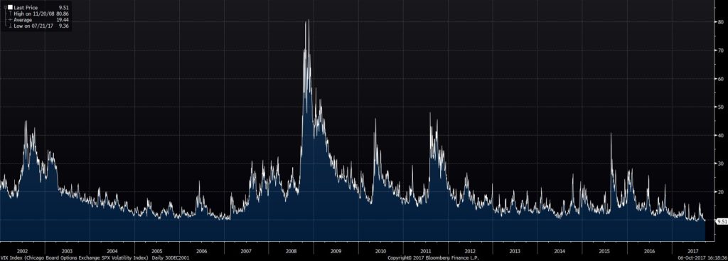
Not to fear: given the current political uncertainty in the United States, there is no doubt that volatility will eventually return, and likely with a vengeance. Our options strategy will then automatically pay off.
Conclusion
Our portfolios reflect our views:
In Canada, we are focusing on companies that have an export quotient, as we are not constructive on the Canadian economy. Furthermore, many of our selections are what many would consider smaller names as they offer more compelling value, and in many cases, higher dividend yields. We have also added to the oil and gas producers in many cases.
In the United States, we have stayed away from the go-go sectors that are currently on fire… as we would expect them to be tamed during the next correction. Instead, Retail, Consumer Staples, Oil and Gas Services are some of our new additions.
In Europe, the Consumer Staples, Telecom and Pharmaceutical sectors continue to be our sectors of choice. Compelling valuations, attractive dividends and good growth prospects are the cornerstones of our selections.
We continue to hold significant cash holdings and are very much mindful of valuations. The overall market is expensive, and so, in this climate, ensuring that the valuations of our selections reflect expectations is critical to minimizing negative surprises.