Video Review
Charts and Data
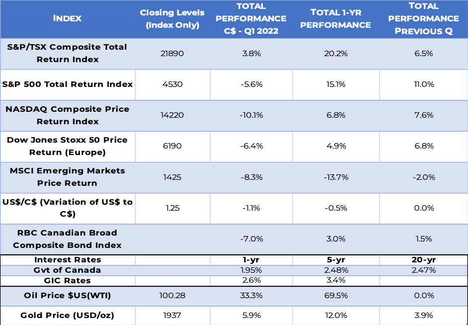
Performance Highlights
Commentary
During the first quarter of 2022, investors in Canadian markets fared much better than those on the U.S. markets, who took a wallop. The broad-based S&P 500 and the NASDAQ indices actually cost U.S. investors: their return was a searing ‑5.6% and ‑10.1%, respectively. Higher interest rates have a stronger impact on growth stocks, which explains such a negative return on the NASDAQ. What buoyed the Canadian market was a spectacular rebound in oil prices that continued with the further reopening of the economy, as it skyrocketed by 33.3%, up 70% over the past 12 months. Also accounting for this stellar Canadian performance: the high demand for commodities in general, and rate increases helping the financial sector. Gold worldwide also continued posting gains, at 5.9%.
The one-year performance of the NASDAQ is 7%, about half the S&P/500’s performance of 15.1%. And, lo and behold, on a 12-month basis the S&P/TSX Composite Total Return Index, a proxy for the Canadian market, is now one of the leaders globally at an eye-popping 20.2%.
We are very pleased with our foresight in going “light” on hot technology stocks when they were the investors’ darlings. Instead, we had turned towards the commodity sector, which had been snubbed for over a decade. From oil and natural gas to most industrial commodities, we knew it was the place to be, and this has proven to be true in spades.
Geopolitical events had a dampening effect elsewhere. The war in Ukraine, with its cascading impacts on energy and food safety, made investing in Europe much less attractive, so performance there turned negative. As for emerging markets, their performance was already negative and remained so. This is in part because Chinese stocks make up 50% the MSCI Index, and the GDP growth of that huge country is now crawling, in part due to its distressed real estate sector.
Going forward, of course, the main concern lies with rising interest rates. Will they continue increasing and, if so, by how much and for how long? Last but not least, is a recession on the horizon? The answer to these questions will have an impact on future stock valuations.
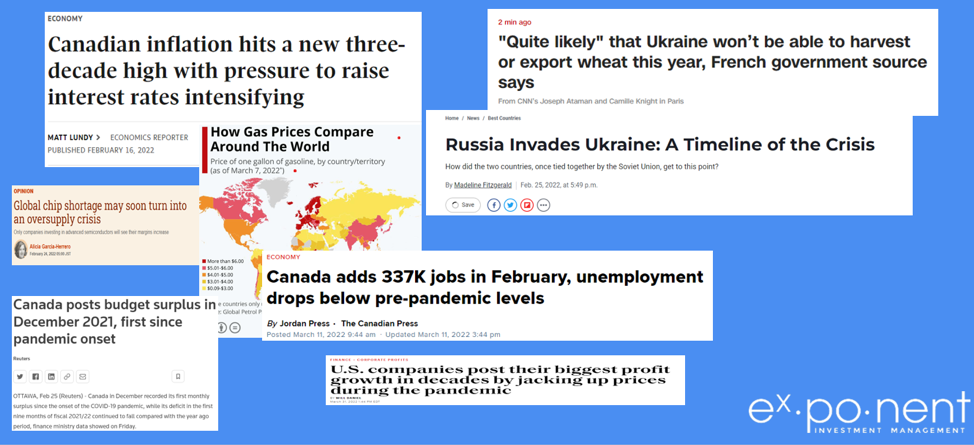
Headlines Are Dominated by Inflation Signals
Performance Attribution
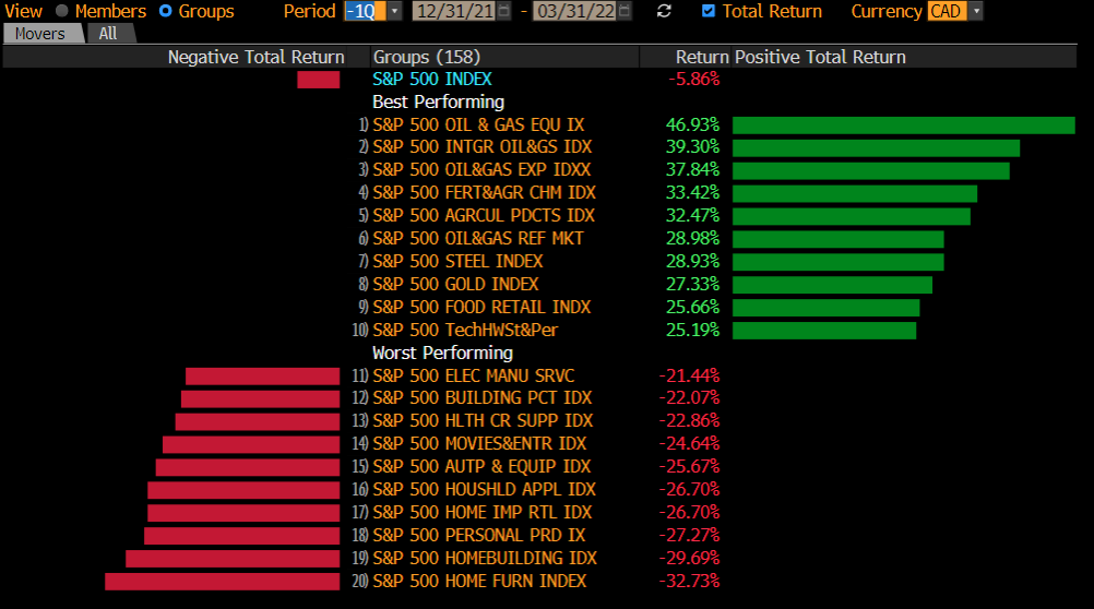
S&P 500 Best and Worst Performing Sectors (United States)
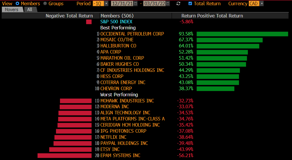
S&P 500 Best and Worst Performing Stocks (United States)
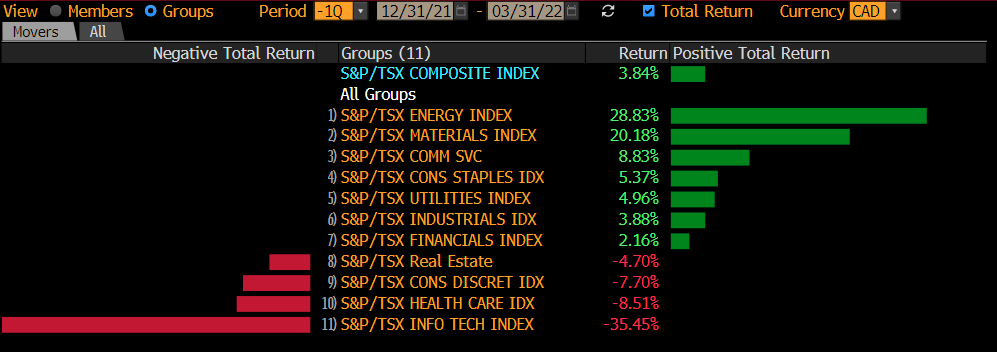
S&P/TSX Best and Worst Performing Sectors (Canada)
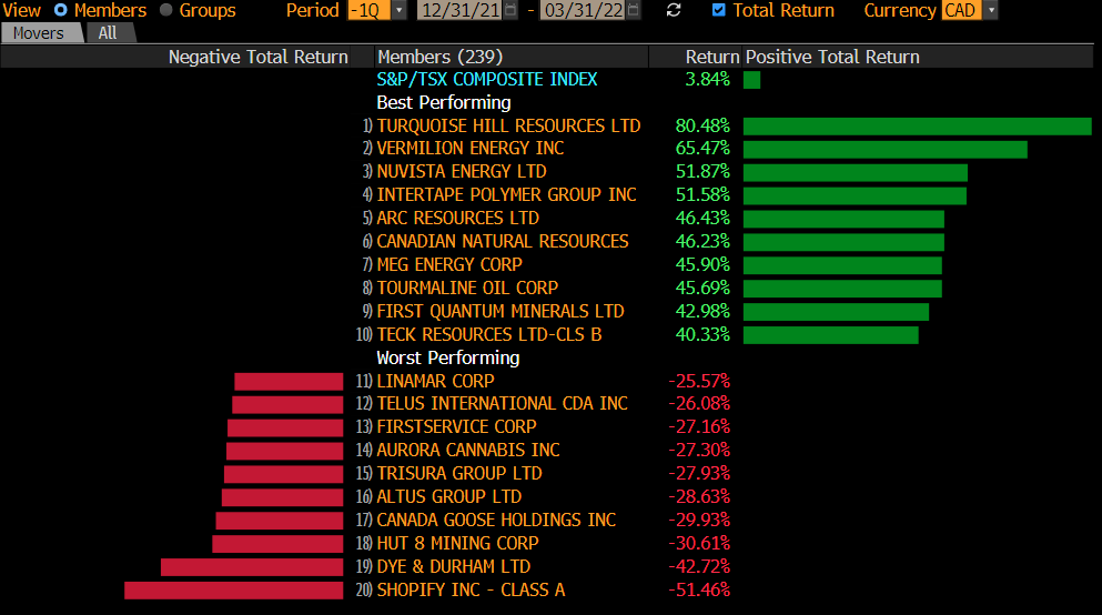
S&P/TSX Best and Worst Performing Stocks (Canada)
Performance Drivers
Rockets
- With investors worried about still snarly supply chains and inflation now at a multi-decade high, the sectors that did well were the classic inflationary-safe sectors: oil and gas, agriculture and food, and materials. Commodity stocks also moved up due to supply constraints as demand reached pre-pandemic levels.
Flares
- Not surprisingly, the worst-performing list this quarter included some of the best-performing stocks of 2021. This includes technology and healthcare, which receded both in the U.S. and Canada, as well as “stay-at-home” stocks. Peloton bikes are now gathering dust in most basements. The stock peaked at $167 last January and is now selling for $27. That is a climb down by 84%. As for the ultimate in escapism, Virgin Galactic peaked at $60 at this time last year. The space travel stock now trades at $10.
The rise in interest rates is the story of the first quarter. The war in Ukraine is top of mind from a humanitarian perspective; however, on the trading screens, interest rates and inflation dominate. In fact, Russian counter-sanctions worsen inflation and hurt world markets by making oil and fertilizers scarcer, thus driving prices up.
As to inflation, while we do not have a crystal ball, we use very enlightening charts and concepts to gain visibility on these most important issues. Read on to know more.
Investing Lesson – Interest Rates, Yield Curves, and Recessions
Interest rates are effectively the cost of money (or more exactly the cost of renting money). This cost impacts asset prices. The higher the interest rates, the more expensive money is, and the more asset prices decline. Why? In short, because investors can receive a relatively higher return on lower-risk investments, such as bonds. Let us look at some graphs to understand the current situation.
Interest Rates and Yield Curves
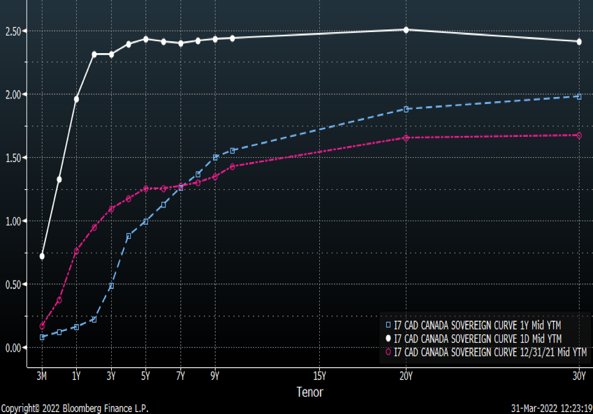
Immediately below is the Canadian yield curve graph, and next is the U.S. yield curve graph.
These curves depict the interest rates that investors are demanding for holding bonds of a certain maturity. The vertical scale on the left indicates the interest rates investors will receive yearly for holding a bond, and the horizontal scale below is the time to maturity of the bond, i.e., the length of time the investor will hold this investment. The white lines indicate the rates investors were receiving of late, on March 30, 2022. The pale blue or turquoise line depicts the rates they received one year ago. The pink line was the yield curve at the end of last year, some 90 days ago.
Canadian Interest Rates and Yield Curves
U.S. Interest Rates and Yield Curves
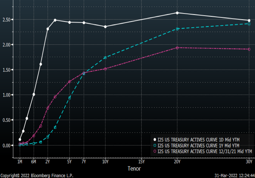
Two noteworthy features stand out:
- The rise that occurred in just a few months is simply spectacular, as evidenced by the white line flying high above the other two lines.
- In the United States, the interest rate earned on 10-year bonds is now lower than on 2-year bonds[1]. This phenomenon is called an “inversion” of the yield curve, as a longer time horizon normally commands a higher interest rate.
Inverted Yield Curves and Recessions
The following graph shed some light on yield curve inversions and their connection with recessions. In this graph, the white line is the difference between the 10-year bond and the 2-year bond. This differential, called the yield spread, is usually a positive number: in other words, 10-year bond holders normally receive a higher interest rate than 2-year bond holders. What is called a yield curve inversion is when this relationship is reversed: short-term investors receive a higher rate than long-term investors.
Such an inversion is often followed by a recession. While not an ironclad law, there have been seven yield curve inversions (highlighted by the red circles), and six recessions (the shaded red columns) since 1977… Also noteworthy: there can be a lag of up to two and half years between a yield curve inversion and the recession.
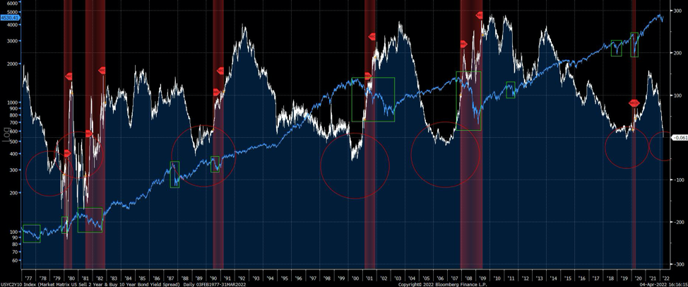
The blue line represents the S&P 500 index since 1977 and shows the damage on the stock market accompanying yield curve inversions and recessions. There have been 10 market downturns of around 20% since 1977, which are represented by the green rectangles. The width of the rectangles follows the length of time each such downturn lasted. Not all of these were accompanied by yield curve inversions or recessions. Also, some of these drops, while dramatic, were quite short-lived. Of course, markets have a tough time during recessions. But all recessions eventually end, and so do bear markets.
[1] The difference between the 20-year and the 30-year maturities is not considered significant as 30-year bonds are much less common and their rarity affects the yield.
Investing in View of a Possible Recession
We believe that a yield curve inversion is an alarm bell to proceed with judicious adjustments. In short, adjustments must be made in the months preceding the reversion. It is also important to know that the leaders of the market going into a significant and protracted (say over 18 months) bear market rarely lead on the other side of the recovery.
From an investing standpoint, not all sectors suffer during a recession. In fact, some companies do particularly well. For example, the late 1990s bull market that culminated and crashed in 2000 was led by technology. The following bull market that began in 2003 was led by commodities and U.S. financials. Microsoft had peaked at $60 in December of 1999 and never breached $60 until December of 2016, a full 17 years later! Then commodities and financials were hurt by the 2008-09 bear market, and the ensuing bull market that began in 2010–2011 was led by sectors such as technology. Another example: Suncor peaked in mid-2008 at $72 and still trades 40% below this peak, 14 years later.
While the pandemic created a unique situation, central banks are decreasing their bond purchases and will be less and less involved in the bond market. Interest rates are returning to their more historical levels. The law of mean reversion is immutable in the investment world. Yet this normalization has now become unusual for everyone, so the effects will be uncomfortable and maybe even ugly.
However, selling everything not an option. There are many adjustments that we are and will be doing to deal with a downturn:
- Just as some assets and stocks do well in inflationary times, others do well in disinflationary times like a recession. We will be investing with this perspective in mind.
- Some companies are virtually recession-proof. Their stock price may be impacted in the short term, until investors realize they need to invest their money and cannot convert everything to cash.
- The ability to invest internationally is an advantage. The United States might be in recession, but perhaps not Canada, Europe or Asia.
- Pruning and even selling out of some of the best-performing assets needs to happen. The concept is to buy low and sell high. Of course, selling high is harder than buying low. This is why it is called a discipline, and why many investors never have the stomach to sell.
- Currently “under-owned” and unloved assets – say Chinese or European stocks, or even some technology names – are worth a look. It can pays to zig when others are zagging!
Conclusion
We remain steadfast in our approach to keep an open mind and are always prepared for various outcomes in the markets, as we are very cognizant that there is a significant probability of an economic slowdown associated with rising rates. We react as solid information and data (rather than media noise) warrant making pertinent portfolio changes. We will continue to make incremental changes to your portfolio are regards exposures, both in terms of sectors and weightings.
We have also added geopolitics considerations into our adjustments. Two years ago, we were exposed to immunobiology and infectious disease experts. These experts have now been replaced by policy and defence experts. We take into account the impact of these new concerns on investor psyche, and thus their corollary impact on asset prices.
As always, we are honoured for the trust you have placed in all of us to manage your investments and we remain available if you have any questions or concerns.