
2nd Quarter 2018
After the difficult first quarter, the performance of the second quarter was very good in the United States and Canada. Despite talks of trade war, a very “exciting” geo-political stage and high valuations, American stock indicies were kind to investors thanks to a strong performance by technology names. Closer to home, the Canadian stocks were led by the energy names. Our loonie had a difficult quarter which means that Canadian Investors investing outside of Canada were rewarded. Interest rates have been rising on both side of the U.S./ Canada border while the tax situation has been much more friendly south of the border when compared to the current situation in Canada.
| Markets | Performance this quarter | Performance year-to-date |
| S&P 500 Total Return – CAD | 5.4% | 7.2% |
| S&P 500 Total Return – USD | 3.4% | 2.6% |
| S&P/TSX Composite Total Return | 6.8% | 1.9% |
| RBC Broad Composite Bond Index | 0.5% | 1.6% |
| U.S. 10-Year Gvt. Bond | -0.3% | -2.6% |
| USD vs CAD | 1.9% | 4.4% |
U.S. Markets
Expectations of continued earnings and price growth
We see a continued “delamination” (separation of sectors) whereby technology is the only game in town in terms of performance as seen by the NASDAQ returns versus the Dow Jones or S&P 500 indices. The technology sector accounted for 102% of the gains of 2018, with Amazon specifically accounting for 34.6% of the index’s gains!
- This year investors are favouring stocks with promising growth prospects to the detriment of stocks with attractive (read: cheap) valuations. The S&P 500 Growth index rose 8% YTD while the Value index gained only 1.5%.
Results and Consensus Overview – U.S. Market (S&P 500 Index)
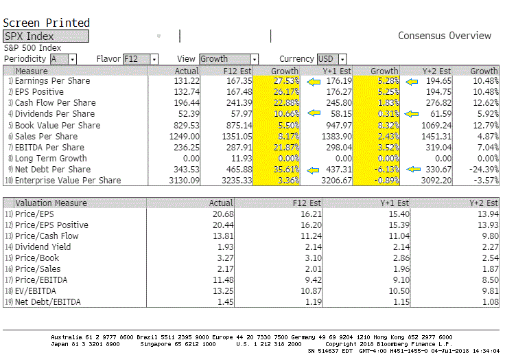
Above are the investor expectations for the S&P 500 index in terms of fundamental results. The few highlighted sections indicate that investors seem to be expecting significant growth in earnings and dividends but also in debt issuance (see the Debt Per Share line) over the next twelve months. However, these expectations are much more muted for the following twelve months and investors are even expecting debt reductions.
Charting the Current Situation
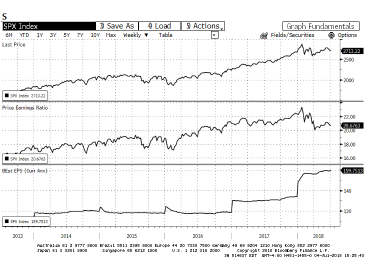
Below is our useful three-pane chart. The five-year evolution of the S&P 500 index is charted on the first pane. The second pane traces the price of the index divided by its earnings (or P/E ratio). The bottom pane shows the index earnings growth.
Prices and Earnings – U.S. Market (S&P 500 Index)
We continue to see good growth in earnings (bottom pane) for the U.S. index. This growth has made the market slightly less expensive (middle pane), while, price-wise, the market itself has been in a holding pattern since late 2017 (top pane).
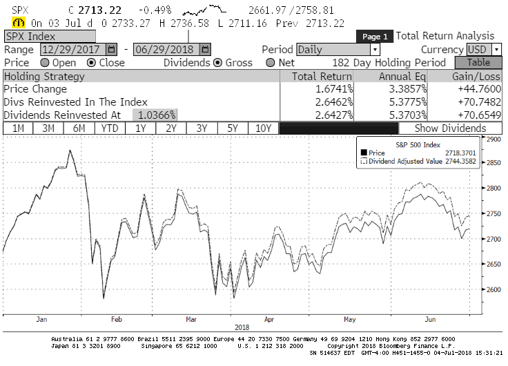
Price Return and Total Return – U.S. Market (S&P 500 Index)
Above, the Total Return chart of the S&P 500 shows a positive return starting in May. The S&P total return grew 2.6% YTD. Interestingly, the dividend income of roughly 1% for the first six months provided nearly 40% of the total return. This explains our intense focus on dividend-paying stocks.

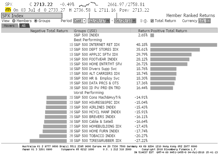
Best- and Worst-Performing Industrial Sectors (YTD 2018) – U.S. Market (S&P 500 Index)
Above is the chart that tracks the different industrial groups that make up the S&P 500 index. We regularly refer to this chart as it shows the leadership of the index. When investors are bullish about the future, the leading sectors tend to be the most volatile ones, such as technology.
Curiously enough, after being some of the weakest performers of 2017, department stores and footwear makers are now among the very best for 2018.
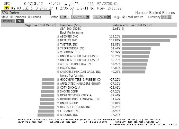
Best- and Worst-Performing Companies (YTD 2018) – U.S. Market (S&P 500 Index)
The chart-toppers in the U.S. continue to be dominated by technology names with valuations that stretch credibility. For instance, Abiomed sells for 106 times its earnings, while Netflix is selling for a P/E ratio of 91 times and Twitter Inc. seems as a “bargain”(!) at 56 times trailing earnings.
Canadian Market
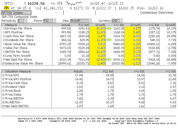
Investor expectations, illustrated below, are bullish for Canada as well. Earnings per share (item 1) are expected to grow 20% in the next twelve months. This boost in expectations is driven by the recovery of the energy sector. Should the global oil supply continue to be constrained due to geopolitical events, we could very well see this number prove to be overly conservative.
The Canadian market remains more attractively-priced than the S&P 500 but the lack of diversification in its fundamentals does account for this discount. The question is whether the discount is large enough or if it will narrow. Furthermore, we continue to monitor the growth in corporate debt, which remains much heavier than the historical average.
We are comfortable with the expected dividend growth but are monitoring the increase in corporate debt. As this is late in the economic cycle and interest rates are quite low, many companies are taking advantage of the cheap cost of money to increase their debt load.
Results and Consensus Overview – Canadian Market (S&P/TSX Composite Index)
Prices and Earnings – Canadian Market (S&P/TSX Composite Index)
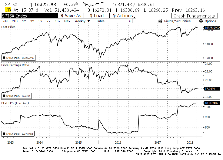
Above is our three-pane fundamental chart. Earnings continued to grow in the second quarter of 2018. Should global growth endure, commodities will continue their upward trend. The top pane charts the price of the S&P/TSX Composite index for the past five years. The market is currently at a historical high. The valuations (middle pane) have now made the market as attractively-priced as it has been in the past five years given the earnings growth (bottom pane) of 2017 and early 2018. It is important to note that this growth in earnings is very much focused in the energy patch.
Price Return and Total Return – Canadian Market (S&P/TSX Composite Index)
The above chart illustrates the total return YTD of the S&P/TSX Composite index. Returns have rebounded from a rough start to 2018. The index gained a mere 0.4% in Q2, with dividends making up the bulk of the returns, and the total return YTD is 1.9%. The case for a focus on dividends remains strong!
The technology space continues to dominate performance in Canada as well. Shopify and Mitel are the largest components of our technology sector. However, Mitel has not made a profit in three years and Shopify has never turned a profit in its entire existence. Caveat emptor.
Best and Worst-Performing Industrial Sectors (YTD 2018) – Canadian Market (S&P/TSX Composite Index)

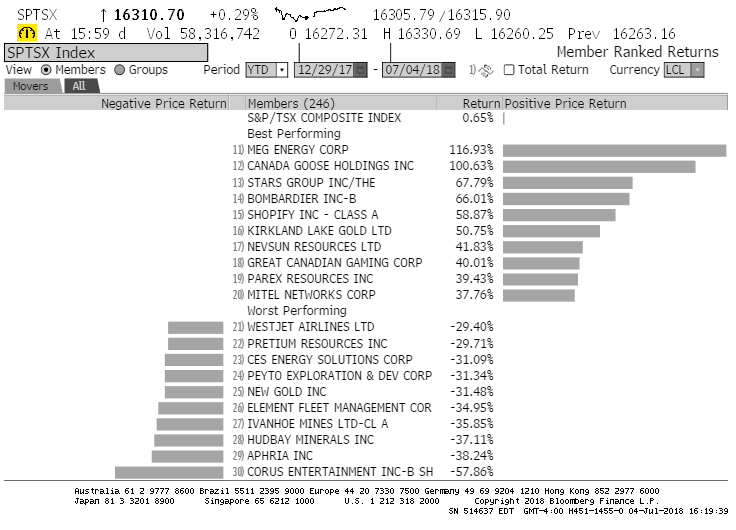
The following table highlights the best and worst-performing individual stocks for the first half of 2018 in Canada. The chart is topped by an energy company that is still down 75% from its 2014 high, by a recent and over-subscribed new offering that is just twelve months old, and by an online gaming company. Quality stocks were clearly not on the menu for investors this quarter.
Best- and Worst-Performing Companies (YTD 2018) – Canadian Market (S&P/TSX Composite Index)
Foreign Markets
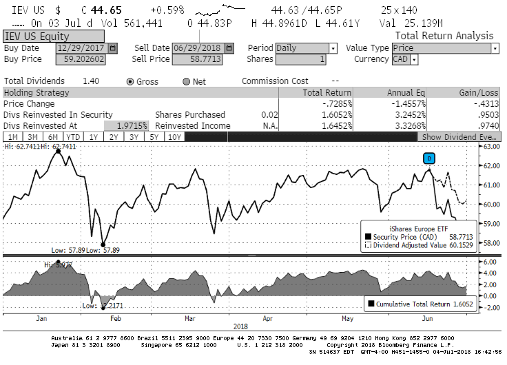
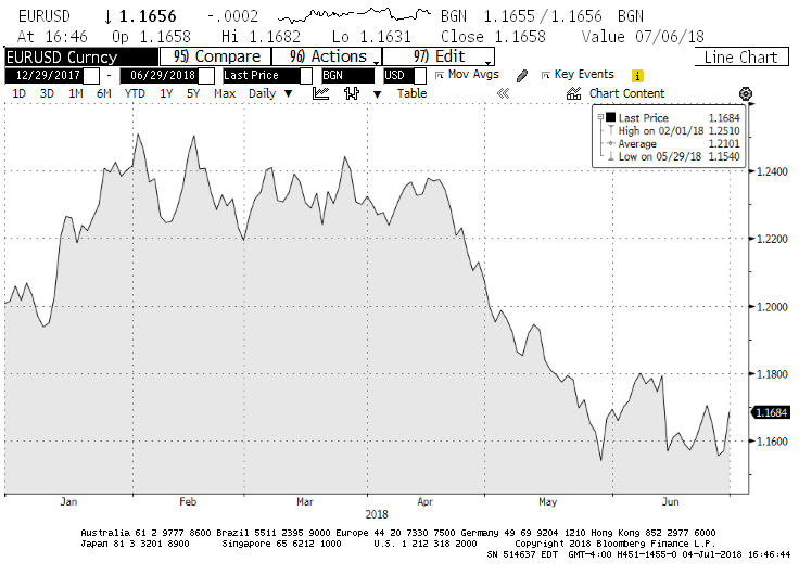
Europe-based stocks are diverging from their U.S.-based peers. Since European indices do not have such a heavy technology weighting, the returns in 2018 have been flat or even negative, depending on the currency. The IEV exchange-traded fund, which invests in 366 of the largest stocks based in Europe, is down 3.1% in U.S. dollar terms, and up 1.6% in Canadian dollars. Most of that negative performance is due to the greenback’s smart appreciation against the euro in 2018. The euro traded at the $1.24 level and is now worth $1.16 USD or so. We have included the currency chart of the EUR/USD below.
Price Return and Total Return (YTD 2018) – European Market (iShares Europe ETF)
Euro/USD Exchange
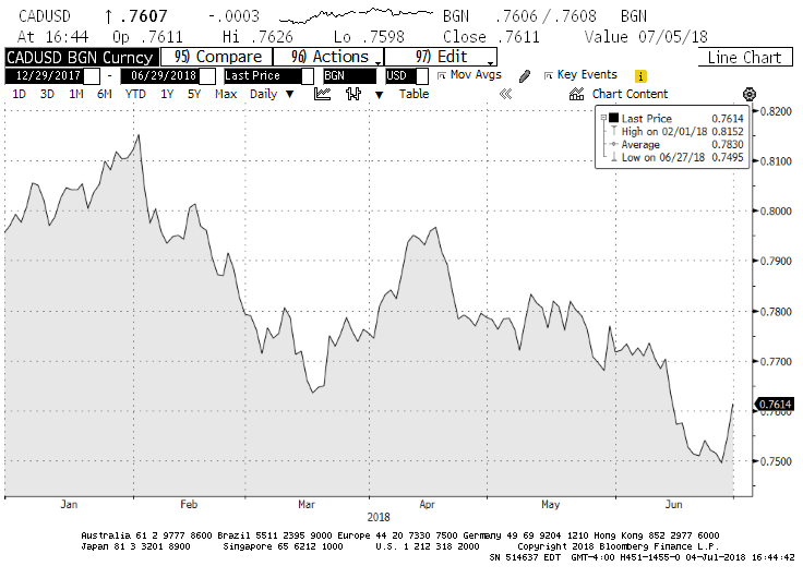
Our Currency
As illustrated below, the Canadian dollar versus the U.S. dollar was down about $0.04 during the first half of 2018. Whereas the loonie was above $0.80 in the early part of the year, it closed the quarter on a slide down to the $0.76 level.
CAD/USD Exchange
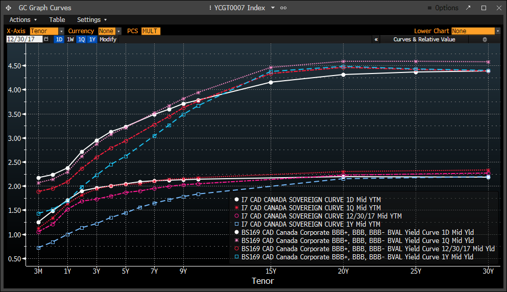
Bonds and Interest Rates
The two charts below track interest rate levels for Canada and the United States. In both charts, you should pay attention to the white lines. Known as the yield curves, these depict the yield received on a certain debt maturity. You will find two sets of the yield curve in each chart. The top curves represent the yield on corporate bonds while the bottom curves chart the yield on government bonds.
Canadian Bonds Yield Curve
American Bonds Yield Curve
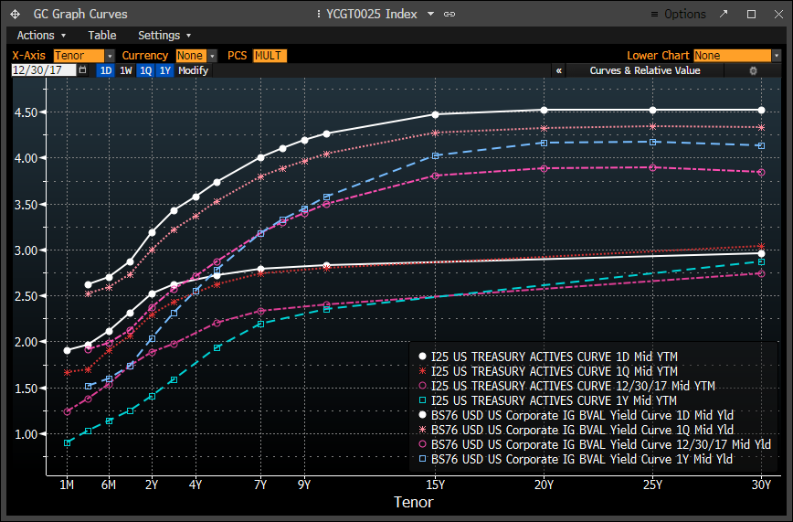
In both graphs, interest rates on both government and corporate debts are rising for the short maturities and have declined lately for the longer maturities. The exception to this trend is the corporate U.S. bond market. Not only is that curve not flattening, it has risen dramatically in twelve months’ time. This deviation could mean that investors are becoming less comfortable with corporate debt levels and thus need to be attracted by higher yields. The top white line in the American diagram has risen substantially across the maturity spectrum. The government bonds’ yield curve (bottom white line of the same graph) is flattening, while corporate rates have not flattened – rather, they have risen substantially. These two developments are not conducive to general economic growth.
In this interest rate landscape, Exponent has limited bond holdings relative to what our investment mandates allow. This helps insulate your portfolio from rising rates. (As a reminder, the value of bonds moves in an opposite direction from interest rates: when rates go up, bond prices fall. Another way of saying this is that existing bonds become less valuable when money can be invested at higher rates…)
Options
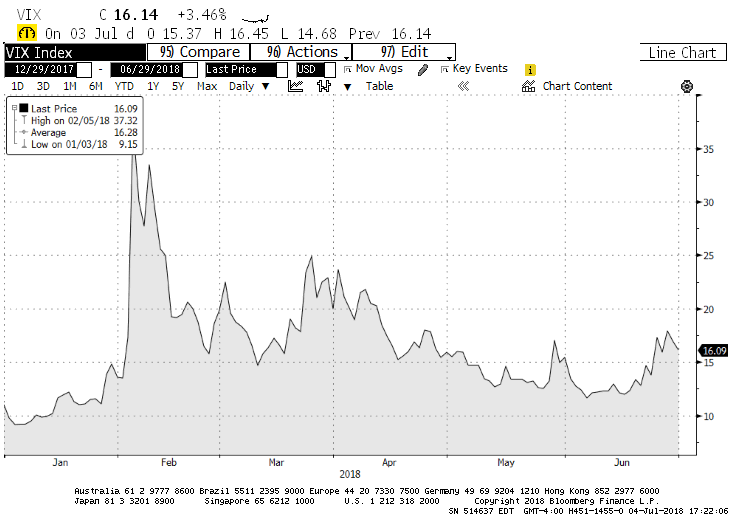
The options market has come back to life in 2018. Market fluctuations in the first and second quarters and a heightened sense of uncertainty have pushed option premiums back up to normal levels.
The VIX index (charted above), which tracks the 30-day volatility of the S&P 500 index, spiked above 30 early this year. A VIX in the vicinity of 15 is ideal for option-selling strategies. Should the current market conditions prevail, we expect that our option premium income will increase as we replace the option sales that are expiring over the coming quarter.
Conclusion
We continue to see value in many sectors and stocks. The typical dividend-paying and steadily growing stock is on sale. As such, we have deployed more capital over the last quarter. Some of our earlier additions, such as energy and pipelines, are generating positive returns, however difficult it may be to keep pace with some of the underlying benchmarks that are heavily weighted in technology. While we continue to shun high-priced and highly volatile stocks in favour of global brands and dominant companies in sectors such as energy, finance and pipelines, it does not mean that your portfolios are comprised of companies on the decline, just that they are not keeping pace (for now).
Yes, the world is changing, and your portfolio requires exposure to these promising new technologies. However, we will continue gain our exposition to these growing businesses through secondary and tertiary means. It is usually the users and the suppliers of new technologies that benefit the most from innovation, not the original developers.
In other words, when there is a gold rush, we prefer to own the sellers of the picks and shovels rather than the gold miners. It limits one’s risk, as you do not have to become fortune tellers and industry insiders to pick the next winners.
Very often, the pioneers of new technology never make it past the early-adoption stage of the technology. Who remembers the Palm or even the BlackBerry? However, the telecom providers are still around – and reaping the profits from these technologies!
Other times, the pioneers do make it all the way to the full adoption of their technology. However, these companies still make terrible investments because the price they command at the peak of the hype makes it impossible for an investor to see a positive return.
For example, Cisco Systems, one of the darlings of the gilded age of the Internet boom, was trading for less than $10 (split-adjusted) per share in early 1998 to a peak of $55 in mid-2000. The stock currently trades for $42.97 (as of the time of this writing), after a recent run-up from $30. In the second quarter of 2000, Cisco’s price was equivalent to 174 times its earnings. This ratio currently sits at 20 times the earnings. Earnings increased, but the price investors were willing to pay for these fell by almost 90%.
The takeaway here is that a great company, even run by John Chambers, an absolute business genius, can still be a terrible investment. The investment thesis was indeed sound: we are all now connected through a network known as the Internet. The cloud is a technological reality, not water vapour. However, if you purchased the stock in 1999 or 2000, you would have seen your investment fall to less than $10 per share in 2003. It was a slow climb to where we are today… which is still more than 25% away from the peak of 2000.
We will thus continue to focus on quality companies delivering shareholder results through a growing dividend policy and prudent debt management. This means that your portfolio will not be exposed to the hottest names, sectors or technologies. However, we are constantly reminded that long-term investment returns are much more about avoiding two ingrained emotions – fear and greed – than it is about finding the “next big thing”.
Your Exponent Investment Management Team
Interesting Research
While my writing skills in a second language may not be what I would like them to be, the research required is certainly one of my favourite quarterly tasks. In fact, I very much look forward to the exercise. Part of the reason for my enjoyment lies in some of the interesting facts I encounter.
The stock market is full of inconsistencies. One of these is how out of kilter market expectations can become, regardless of facts. Let me share with you one of the recent ones I came across: groceries and cannabis. Looking at one of the current market darlings, Canopy Growth, compared to a stodgy grocery store such as Empire, which owns Sobey’s and a few other banners, one finds some astounding anomalies.
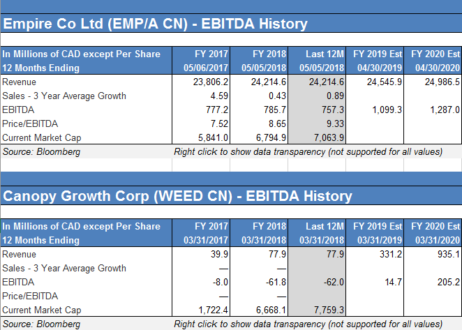
Above is a very simple comparison. Both companies have a market capitalization (stock market value) of over $7 billion CAD. However, Empire had revenues of $24 billion, and Earnings Before Interest, Taxes, Depreciation and Amortization (or “EBITDA”), a cash flow measure, of $757 million.
The growth prospects of Empire are not that enticing, at about 1% per year. Canopy Growth has shown a fantastic growth in sales, with more to come. However, the new kid on the block does not yet have a positive cash flow and should generate only about 1/6 of Empire’s cash flow in two years’ time… if all that growth does come to fruition. To ascertain whether Canopy is correctly priced, one would need to know how much of the future growth of the company is “baked” into the current quote. Time will tell, but we’re not betting on there being much room left…